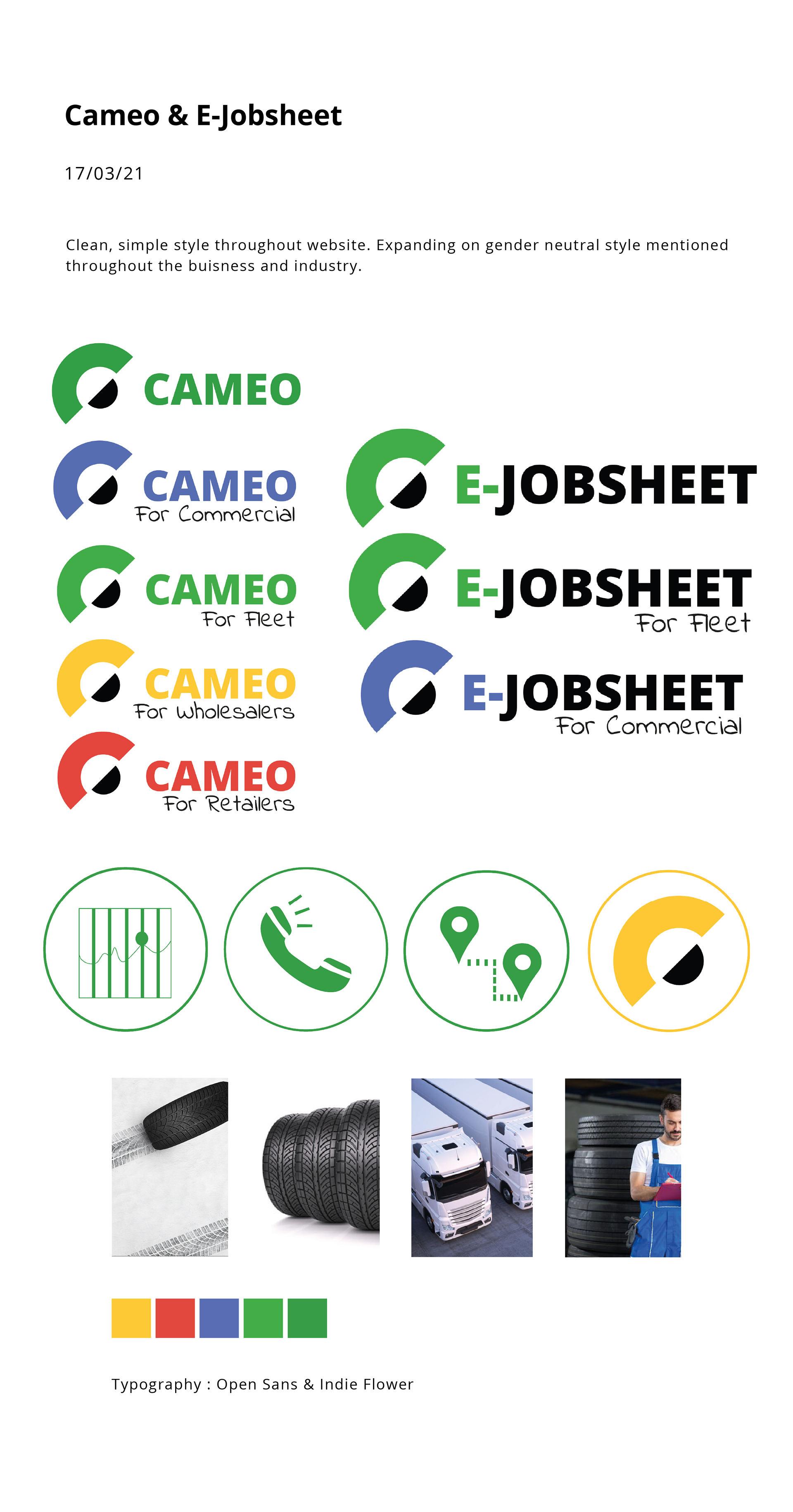

Working along side the marketing team for CAM we developed a new logo identity for 2 of the sectors. Concept was to have an abstract style image of a tire for the icon.


Final feedback from the client was to use a different colour for the fleet uses of the logo as the two shades of green look too similar. This was a change that was made before handing over the final files.
